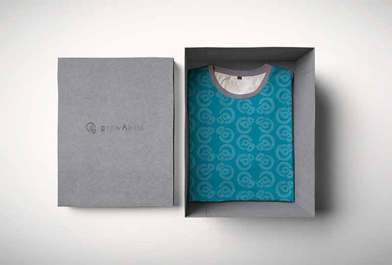
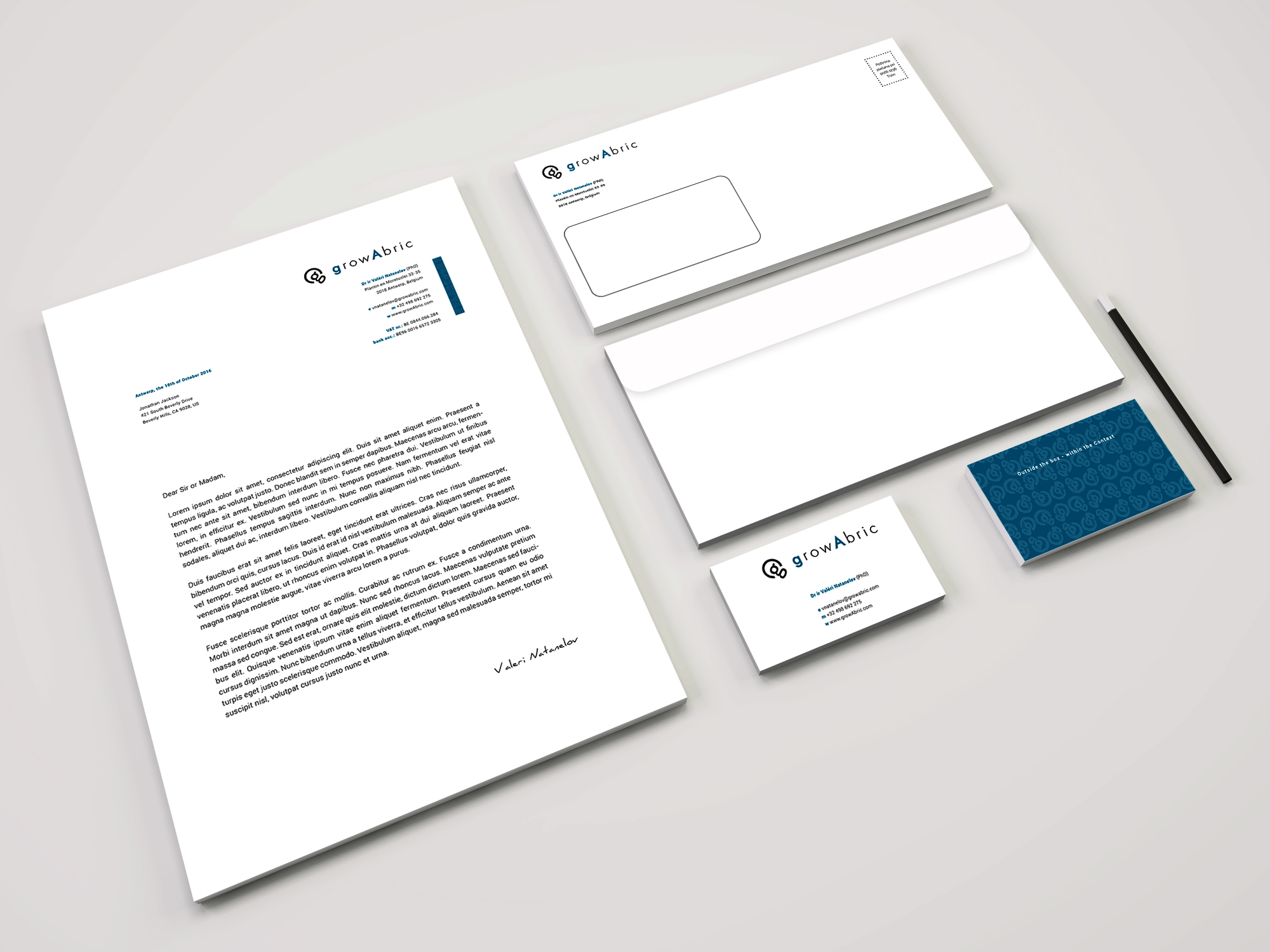
Visual Identity and Website for growAbric
GrowAbric is an international management consulting and technology services company with emphasis on research, holistic analysis, implementation and operational support focusing on eliminating waste and optimizing the process.
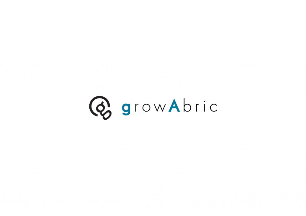
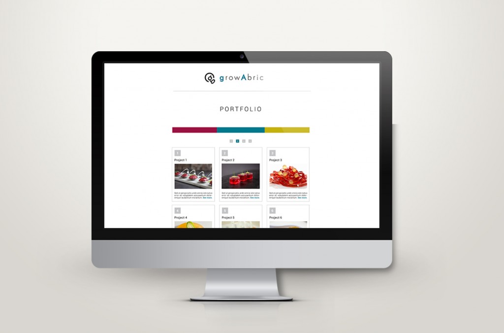
Logo of growAbric:
Binocular “g” forms a core of the bulb, and the circle around it finished the shape of the bulb itself. Bulb is a symbol of wisdom and ideas. The ears of letter “g” are two points in the network which are connected together which symbolizes the interaction, synergy and connection. Juxtaposition of the letter g and the circle around forms an aureola, “the radiance of luminous cloud” which has always given a enlightening connotation to characters surrounded by it. At the same time we can recognize the subtle connotation of a copyright symbol. Circle by itself is known as a symbol of unity, wholeness, inclusion, perfection and infinity. Round shapes of the logo make it look friendly, when at the same time sharp parts of letters that follow make it focused on details, accuracy and precision. 
Binocular “g” used in a logo is sans-serif but derives from older serif typefaces so it represents tradition and experiences of the company meanwhile the logotype itself is sans-serif, very modern and contemporary, and it is subtly hinting that a company is always up to date and in the step with time.